UX Collective | Medium
Follow
Please don’t stretch your app for foldables
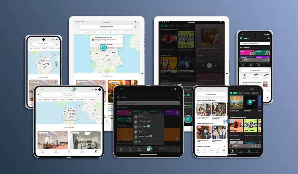
The advent of foldables like the iPhone Duo has shifted the design landscape beyond fixed screens. Previously, foldables were primarily an Android concern with limited user adoption. However, the buzz around Apple's foldable, coupled with strong sales forecasts, necessitates adaptive app design. Developers must now consider how content and user interfaces respond to varying screen sizes, aspect ratios, orientations, and postures. Instead of designing for specific devices, the focus should be on adapting to available space and user interaction. This involves preserving the hierarchy of content and key actions while adjusting navigation, content density, and column layouts.It's crucial to avoid simply stretching the UI across larger displays. Instead, embrace practices like using multiple columns, adding gutters, and ensuring responsive grids. Designs should also be hinge-aware, avoiding the placement of critical interactive elements or text across the fold. Thinking in terms of "panes" – a primary pane for phones and multiple related panes for foldables – aids in designing effective layouts like list-detail or navigation-content.Understanding the different foldable states is paramount: closed (phone-like), open (book-like, offering more space), and half-open (tabletop or book modes) which create distinct usable regions. Apps must seamlessly adapt navigation, controls, and overlays to these changing configurations without losing user context. This includes preserving the user's location and navigation state during transitions between folded and unfolded states. Both iOS and Android offer guidance on utilizing size classes and window metrics to create these adaptive layouts. Ultimately, designing for foldables requires a shift towards flexible, space-aware design principles, ensuring a cohesive and functional user experience across diverse device forms.