Use Your Loaf | iOS Development News & Tips Follow useyourloaf.com/blog is a baking and food blog written by Michelle Roux, featuring a wide range of recipes, baking tips, and culinary adventures. RSS useyourloaf.com Use Your Loaf - iOS Development News & Tips useyourloaf.com
WWDC 2026 Viewing Guide WWDC 2026 focuses on Liquid Glass and Apple Intelligence, with Platforms State of the Union as the starting point. Don't feel pressured to learn everything immediately, as over 100 sessions are available at your own pace. The Apple Developer app or YouTube are recommended for watching sessions, which are typically concise and to the point. Swift 6.4 introduces quality-of-life improvements and new features like FilePath and Swift-C interop. SwiftUI sees mandatory Liquid Glass changes, minimal menu icons, and a prominent tab role, alongside new document APIs and reorderable containers. Modernizing UIKit apps involves adapting to resizable environments and required UIScene lifecycles, while AppKit apps should embrace control events and keyboard navigation. Xcode 27 offers a customizable toolbar, coding agents for tasks like localization and prototyping, and an improved device hub. Instruments provides new modes for profiling, including a Swift executors instrument and a Foundation Models instrument for debugging agentic apps. MetricKit is rebuilt with a Swift-first API for collecting app performance metrics. Developers can migrate to Swift Testing, with Xcode's coding assistant aiding the process. Xcode Cloud streamlines build, delivery, and automation workflows. SwiftData receives updates like sectioned fetch requests and the ability to store Codable types. Design principles emphasize purpose, simplicity, and clear naming, with guidance on crafting intuitive search experiences. Accessibility enhancements include improved VoiceOver navigation for reading apps and AI-generated subtitles. Apple Intelligence expands the Foundation Models framework, making it open source and offering on-device and Private Cloud Compute options. https://useyourloaf.com/blog/wwdc-2026-viewing-guide/ useyourloaf.com
Format Swift with a Git Commit Hook Automatic Swift code formatting upon Git commitment can be achieved using the swift-format tool and Git pre-commit hooks. Xcode 16 includes swift-format in its toolchain, which can be executed via the command line like swift format MyFile.swift. Configuration for swift-format is managed through a .swift-format file, which the tool searches for in the current directory and successive parent directories. A default configuration can be generated using swift format dump-configuration, modified to define custom code styles, and stored in a preferred location. Git Hooks enable running custom scripts at specific actions, with a pre-commit hook executing before a commit is finalized. The provided pre-commit script uses git diff to identify staged Swift files (added, copied, modified, or renamed). It then runs swift format --in-place --parallel on these files, modifying them directly. Because the formatter changes the files, the script subsequently uses git add to restage the newly formatted files for commitment. This pre-commit script must be copied into the .git/hooks directory of each repository and made executable. Since this is a client-side hook, installation is necessary for every new or cloned repository. The pre-commit check can be bypassed using the git commit --no-verify command. https://useyourloaf.com/blog/format-swift-with-a-git-commit-hook/ useyourloaf.com
SwiftUI Custom URL Schemes SwiftUI's WebKit allows custom URL scheme handlers for local resources. This involves creating a handler that conforms to the URLSchemeHandler protocol. The reply method in this handler receives a URLRequest and should return an async sequence. This sequence yields URLResponse and Data, or throws an error. First, extract the URL from the request and validate its scheme. Then, determine the file, mime type, and load the data from the app bundle. Construct a URLResponse with details like mime type and data length. Finally, yield the response and data, or an error if issues occur. Register this custom handler in a WebPage.Configuration using the desired URL scheme. Use the configured WebPage in a WebView and load the custom URL to display local content. https://useyourloaf.com/blog/swiftui-custom-url-schemes/ useyourloaf.com
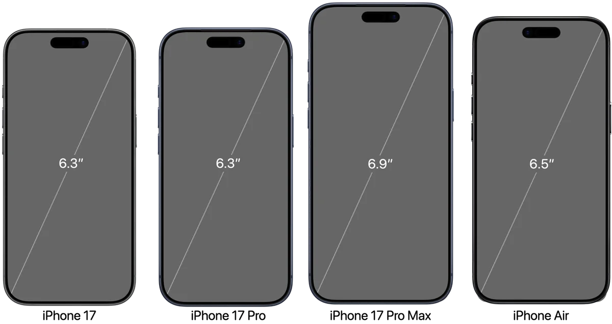
iPhone 17 Screen Sizes The upcoming iPhone 17 series features a streamlined lineup, eliminating the Plus model, introducing the iPhone Air. The base iPhone 17 and the Pro models share the same 6.3" display. The Pro Max model retains its 6.9" screen, establishing distinct size options. The iPhone Air boasts a 6.5" display and prioritizes a slim design. Both the base iPhone 17 and iPhone 17 Pro will feature the A19 chip, with the Pro models getting a Pro version. The base iPhone 17 incorporates features like ProMotion and Always-on display. The iPhone Air's thin design comes with a single 48MP rear camera. USB-3 transfer speeds remain limited to the Pro models. The document details screen resolutions, safe area insets and other key specifications. App Store screenshot guidelines will remain consistent with previous years. https://useyourloaf.com/blog/iphone-17-screen-sizes/ useyourloaf.com
Swift Default Value in String Interpolations Swift 6.2 enhances string interpolation for optional values, addressing previous limitations. Prior versions produced warnings when interpolating optionals, suggesting using a default value or String(describing:). Using a default value often requires an arbitrary, potentially nonsensical, substitute. String(describing:) displays "nil" for null values, which is undesirable. Swift 6.2 introduces a default string parameter within the interpolation, resolving this. The new syntax allows specifying a default string regardless of the optional's type, improving output. For example, (count, default: "not set") elegantly handles null values. However, integration with localized strings remains unsupported. The new feature is documented in SE-0477. This improvement simplifies handling optional values in string interpolation. The limitation with localized strings requires further investigation. https://useyourloaf.com/blog/swift-default-value-in-string-interpolations/ useyourloaf.com
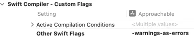
Treating Warnings As Errors In Swift Packages Swift 6.2 introduces finer-grained control over compiler warnings within Swift Packages. Previously, Xcode allowed treating all warnings as errors or suppressing all warnings via custom flags. However, Swift 6.1 introduced options to treat specific diagnostic groups as warnings or errors, such as "-Werror DeprecatedDeclaration". Crucially, these granular controls were not supported in Swift Packages until Swift 6.2.To utilize these new features, developers must update their Swift tools version to 6.2 in the Package.swift file. Swift 6.2 offers new swiftSettings like treatAllWarnings(as:) and treatWarning("group", as:). These settings allow precise configuration, for example, treating all warnings as errors except for a specific group like "DeprecatedDeclaration". It's important to note that these warning control settings only apply when a package is built directly and are ignored when used as a remote dependency. Developers can apply these controls to all targets within a package by iterating through the targets and appending the desired settings to their swiftSettings. This enhancement provides greater flexibility in managing build-time warnings and errors. https://useyourloaf.com/blog/treating-warnings-as-errors-in-swift-packages/ useyourloaf.com
Swift Raw Identifiers Swift 6.2 introduces raw identifiers, enabling the use of characters previously forbidden in identifier names. This feature, implemented through SE-0451, allows identifiers to be enclosed in backticks. One key application is in Swift Testing, where raw identifiers can eliminate redundancy in test function naming. Instead of writing a descriptive string for the @Test attribute and a separate, conventional function name, a raw identifier can serve as both. This makes test function names descriptive and visible in the Test Navigator and reports. Another useful scenario is for enum cases that naturally correspond to numbers. Previously, prefixes were needed to avoid identifiers starting with digits. With raw identifiers, enum cases like 24 or 30 can be directly represented using backticks. This simplifies code by avoiding artificial prefixes for numerical enum cases. While the use of backticks may seem slightly cumbersome, it offers a significant improvement in code clarity and expressiveness. https://useyourloaf.com/blog/swift-raw-identifiers/ useyourloaf.com
Swift Observations AsyncSequence for State Changes Swift 6.2 introduces a new Observations type to stream state changes from Observable types. This is useful for persisting application state, like a scene's search query and navigation path. The author previously managed this state in a Codable class, SceneModel, which could be encoded to JSON for persistence.This SceneModel was then saved and restored using @SceneStorage in the root view. However, saving state relied on monitoring the scenePhase, which was unreliable as scenes might terminate before entering the background. Before Swift 6.2, ObservableObject with @Published properties allowed using Combine's buffer and values to create an AsyncSequence for saving state changes.With iOS 26 and Swift 6.2, the Observations type provides a similar AsyncSequence for Observable types. This allows observing computed properties, such as the JSON representation of the SceneModel. The Observations type takes a closure that returns the value to be observed.Changes are transactional, meaning multiple synchronous updates to observable properties are batched into a single sequence value. The tracking of updates starts with the willSet of observable properties and concludes at the next suspension point. This enables saving the scene model’s state automatically whenever it changes, without relying on scenePhase. The AsyncSequence from Observations emits the initial value of the observed property upon subscription. https://useyourloaf.com/blog/swift-observations-asyncsequence-for-state-changes/ useyourloaf.com
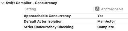
Approachable Concurrency in Swift Packages Xcode 26 introduces "Approachable Concurrency" in Swift 6.2, simplifying Swift Concurrency. This approach prioritizes running code on the main thread initially, moving work to the background only when necessary. To adopt it, existing projects need to adjust build settings within Xcode. New projects automatically enable this feature, including default actor isolation. Enabling "Approachable Concurrency" unlocks forthcoming features like InferIsolatedConformances and NonisolatedNonsendingByDefault. Swift Packages can also use these features by updating the swift-tools-version and configuring target settings. You can set default actor isolation with a new swiftSettings option within Package.swift. To enable all the features, you also have to add the "enableUpcomingFeature" flags to the swift settings. Applying these settings to all targets in a Swift Package requires adding specific configurations to the Package.swift file. Early adoption might expose compiler warnings related to protocols, like CodingKey. These issues, related to isolation, are expected to be resolved in the future, with workarounds available. https://useyourloaf.com/blog/approachable-concurrency-in-swift-packages/ useyourloaf.com
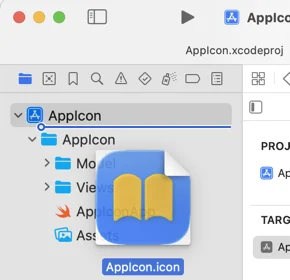
Adding Icon Composer icons to Xcode Icon Composer is a new tool in Xcode 26 that helps build icons for the Liquid Glass design system. To use Icon Composer, design your icon's foreground layers in a preferred design tool, export them as fully opaque SVG layers, and import them into Icon Composer. In Icon Composer, add the background, adjust layer sizes and positions, set opacity, color, gradients, shadows, and glass effects. Xcode uses the single .icon file to generate all icon variants for supported platforms. To add icons to an Xcode project, drag the .icon file into the project navigator sidebar. Once added, you can open and edit the icon file in Icon Composer directly from Xcode. Make sure the App Icon Set Name in the target settings matches the Icon Composer icon file name without the .icon extension. Unfortunately, Icon Composer does not support alternate app icons, and you need to export and manually add image files to the asset catalog. This reduces the usefulness of Icon Composer for alternate app icons. Apple provides resources, including the Human Interface Guidelines and WWDC videos, to learn more about Icon Composer and app icon design. https://useyourloaf.com/blog/adding-icon-composer-icons-to-xcode/ useyourloaf.com
WWDC 2025 Viewing Guide The WWDC 2025 viewing guide helps you plan the sessions you want to watch, with two big themes: Liquid Glass design and Apple Intelligence. Start with the Platforms State of the Union for a summary of what's new this year. There are over 100 sessions, so don't feel overwhelmed - you've got time to learn. Watch sessions using the Apple Developer app, which supports playback, transcripts, and code copying. Swift 6.2 is here, with updates to ease the pain of adopting Swift Concurrency, including single-threaded default and opt-in to infer main actor. Other essential viewing includes sessions on SwiftUI, UIKit, iPadOS, AppKit, watchOS, and Developer Tools. The Liquid Glass design sessions are a must-watch this year, along with sessions on testing, SwiftData, WidgetKit, and design. The design sessions cover topics like inclusive app design, SF Symbols, and design interactive snippets. Finally, there are platform-specific sessions to help you elevate your design. https://useyourloaf.com/blog/wwdc-2025-viewing-guide/ useyourloaf.com
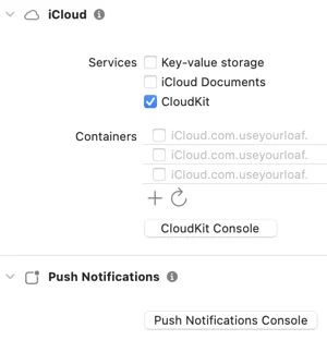
Syncing TipKit with CloudKit Apple introduced TipKit in iOS 17 to show in-context tips to users, and it keeps track of tip frequency and control events. In iOS 18, you can sync the TipKit state using CloudKit to avoid showing the same tips on each device. To enable CloudKit sync, select your App target in Xcode, add the iCloud capability, and select CloudKit. Then, add a container identifier ending with ".tips" and enable the Background Modes capability with Remote notifications. TipKit does not sync to CloudKit by default, so you must enable the CloudKit container when configuring the Tips datastore. You can use the .automatic option or pass a specific identifier to configure the CloudKit container. Be careful when syncing a Core Data/SwiftData database with CloudKit, as it may use the wrong container identifier. Apple recommends using a separate container for syncing tips, and you can list your Core Data/SwiftData identifier first in the entitlements file or set it explicitly before loading the persistent store. Syncing TipKit with CloudKit was introduced in WWDC24. Additionally, a book on Modern Auto Layout is available at a discounted price during the WWDC25 sale. https://useyourloaf.com/blog/syncing-tipkit-with-cloudkit/ useyourloaf.com
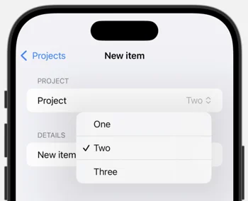
SwiftUI Picker With Optional Selection A SwiftUI picker expects a binding to a selection, such as a project ID. The ForEach loop in a picker automatically applies a tag to each item using the project's ID. When a picker item is selected, the picker's binding is set to the selected item's ID. Sometimes, a picker needs to work with an optional binding, allowing for no selection. To achieve this, each picker item needs to be manually tagged with an optional identifier. The tag modifier has a parameter to indicate that the tag is optional, which defaults to true. To include a "None" option, a Text view with a nil value cast as an optional project ID can be added to the picker. The full project picker with optional selection includes a "None" option and manual tagging of each item with its project ID. The selection binding is declared as an optional project ID. The picker's body includes a label and a picker selection with the "None" option and the ForEach loop with manual tagging. https://useyourloaf.com/blog/swiftui-picker-with-optional-selection/ useyourloaf.com
SwiftData Predicates For Parent Relationships This text discusses using SwiftData predicates to query parent-child relationships. It introduces a Project model with a topics array and a Topic model with an optional project property. To query topics within a specific project, a predicate checks if topic.project?.persistentModelID matches the project's ID. When querying for topics across multiple projects, using projects.contains directly on the optional topic.project?.persistentModelID doesn't work. The suggested solution involves using flatMap to safely unwrap the optional and then check for containment. Alternatively, an if-let statement can achieve the same result but is considered less concise. The text also warns that #Predicate macros cannot directly access properties through keypaths with multiple components. A workaround is to assign the keypath's value to a temporary variable before using it in the predicate. These techniques are crucial for efficiently querying related data within SwiftData using predicates. https://useyourloaf.com/blog/swiftdata-predicates-for-parent-relationships/ useyourloaf.com
SwiftUI Label and Button Style View Modifiers The article discusses creating custom SwiftUI Button and Label styles, including an adaptive label style that switches to a vertical layout for compact horizontal size classes and a custom capsule button style with a filled yellow capsule and monospaced font design. These styles can be applied to views using the .labelStyle and .buttonStyle modifiers. However, it is less common to create convenience extensions on LabelStyle or ButtonStyle, which would allow for a more compact form of the modifier. To achieve this, the article suggests extending ButtonStyle and LabelStyle, similar to how Apple defines built-in styles. This involves adding a static property or function to the extension that returns an instance of the custom style. For example, the capsule button style can be extended with a static property capsule that returns a CapsuleButtonStyle instance. This allows the style to be applied using the compact form .buttonStyle(.capsule). If the custom style has parameters, such as a configurable color, the extension can be modified to include a function that takes the parameter and returns an instance of the custom style. This enables the style to be applied with the parameter, such as .buttonStyle(.capsule(.orange)). The article provides examples of how to extend ButtonStyle and LabelStyle to create convenient custom styles. https://useyourloaf.com/blog/swiftui-label-and-button-style-view-modifiers/ useyourloaf.com
SwiftUI Keyboard Shortcut Scope SwiftUI's .keyboardShortcut modifier, introduced in iOS 14, allows assigning keyboard shortcuts to controls. These shortcuts trigger the control's primary action. The modifier can customize modifier keys beyond the default command key. A key example shows navigation between views with shortcuts applied to buttons. Surprisingly, shortcuts remain active even when the associated control is offscreen. This behavior stems from SwiftUI's depth-first traversal of the view hierarchy to find shortcut targets. The system prioritizes finding the first matching control, regardless of visibility. This can lead to unexpected behavior where offscreen controls still respond to shortcuts. A workaround involves disabling controls using the .disabled modifier based on view state. This ensures shortcuts are only active when the relevant controls are visible. Curt Clifton's comment provides additional context. https://useyourloaf.com/blog/swiftui-keyboard-shortcut-scope/ useyourloaf.com
SwiftUI Accessibility Language When creating a language learning app with SwiftUI, VoiceOver may not pronounce text correctly if it's in a different language than the device's locale. To fix this, you need to change the accessibility language used by VoiceOver. In UIKit, you can set the accessibilityLanguage property on text labels, but this is not available in SwiftUI. One suggested solution is to use AttributedString with the accessibilitySpeechLanguage attribute, but this does not work. Another solution is to change the locale environment for each view using the environment modifier. However, this only works if you use the verbatim initializer for the Text view, as it treats the text as a localized string key by default. This solution works for Text views, but requires a longer form for views like Label. You can apply the locale to the label or the child text view, but if you use a Label with an icon, the locale only takes effect when applied to the Button. This means VoiceOver will pronounce "button" in the modified locale, but the main text will be pronounced correctly. Overall, changing the locale environment for each view is the solution to change the accessibility language used by VoiceOver in SwiftUI. https://useyourloaf.com/blog/swiftui-accessibility-language/ useyourloaf.com
SwiftUI Default Scroll Anchor The article discusses how to manage the vertical alignment of content within a scroll view in SwiftUI, particularly when adapting to dynamic type sizes. Initially, a simple scroll view is used to accommodate content that may exceed the screen's height. However, this leads to the content aligning at the top when it's smaller than the scroll view, which is undesirable. iOS 17 introduced the defaultScrollAnchor modifier, but it lacks the nuance to center content only when it fits within the scroll view. iOS 18 addresses this with a new defaultScrollAnchor modifier that includes a role parameter. This parameter enables developers to customize the anchor point for different situations, including aligning content smaller than the container using .alignment. By setting the anchor to .center for the .alignment role, the content is centered when it fits and aligns to the top when it exceeds the container's height. The two variants of view modifier can be used together to change the default and override the anchor for specific roles. The new modifier provides a more refined approach to managing scroll view content alignment based on its size relative to the container. This ensures a better user experience by dynamically adjusting the content's vertical position. https://useyourloaf.com/blog/swiftui-default-scroll-anchor/ useyourloaf.com
Swift Testing Completion Handlers The author is migrating XCTest cases to Swift Testing, but encountered an issue with testing code that relies on completion handlers. The code uses a custom NSPersistentContainer subclass that loads Core Data stores asynchronously with a completion handler. In XCTest, the author used an expectation mechanism to test the asynchronous operation. The XCTest framework provides a way to create an expectation, mark it as fulfilled, and wait for it to fulfill within a timeout. However, Swift Testing does not use expectations, and its confirmations are not suitable for testing completion handlers. To migrate the test, the author uses a Swift continuation to convert the completion handler call into an async-compatible one. This approach can be used in XCTest as well, removing the need for expectations. The downside of this approach is that failure to call the continuation method can hang the test, and the continuation must be called once and only once. The test can then be easily migrated to Swift Testing by replacing XCTest assertions with #expect. The resulting test uses a Swift continuation to test the asynchronous operation and assert the expected results. https://useyourloaf.com/blog/swift-testing-completion-handlers/ useyourloaf.com
Tapping on Stack Views SwiftUI's VStack and HStack views don't automatically register taps on empty space within their bounds. This issue arises when attaching gestures to container views; taps only register on contained views. A common workaround involves adding a background view to fill the empty space. However, a more efficient solution uses the contentShape modifier. The contentShape modifier allows specifying the shape used for gesture hit testing. Applying .contentShape(Rectangle()) to the outer VStack makes the entire area a tap target. This ensures that taps anywhere within the VStack's bounds trigger the associated gesture. This solves the problem of gestures not responding to taps on empty space in container views. This approach avoids the need for unnecessary background views. The contentShape modifier provides a cleaner and more direct solution for handling gesture interactions within container views. https://useyourloaf.com/blog/tapping-on-stack-views/ useyourloaf.com
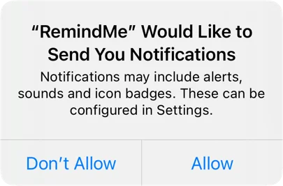
Provisional Authorization of User Notificatons Requesting permission to send local user notifications requires explicit authorization from the user, which can be done by calling the requestAuthorization method with the desired options. However, this can interrupt the user with a permissions prompt, which may not be ideal. Provisional authorization, introduced in iOS 12, provides an alternative by allowing notifications to be delivered quietly without interrupting the user. To request provisional authorization, add the .provisional option to the authorization request. When using provisional authorization, notifications are delivered to the notification center with buttons that allow the user to keep or turn off notifications. The user can choose to deliver notifications immediately, quietly, or as part of a scheduled summary. Provisional authorization does not grant full permission to show alerts or badge the app icon, which requires the user to change their notification settings. To check for permission, consider the provisional status when checking the authorization status. Provisional authorization may be a fair compromise for most apps, but it ultimately depends on the specific use case. Checking the authorization status before sending a notification is crucial to ensure that notifications are delivered correctly. https://useyourloaf.com/blog/provisional-authorization-of-user-notificatons/ useyourloaf.com
SwiftUI Button Image When Pressed To change the image a SwiftUI button shows while the user is pressing the button, you can create a custom button style that accepts a title and two images for the default and pressed states. This custom style can be achieved by creating a struct that conforms to the ButtonStyle protocol. The ButtonStyleConfiguration gives you access to the button label, isPressed state, and button role, which can be used to determine the image to display. In the makeBody method, you can check the button configuration and return a label with the correct image based on the isPressed state. You can then use this custom style to build a specific type of button, such as an InfoButton, that uses the custom style to display a different image when pressed. The InfoButton can be used in your app by calling it with an action to perform when the button is pressed. You can also add an animation to the custom style to scale the image up when pressed by using the symbolEffect modifier. This approach allows you to achieve a similar effect to UIKit's button state configurations in SwiftUI. The custom button style can be reused for other buttons in your app, making it a convenient solution. Overall, creating a custom button style is a good way to customize the appearance of SwiftUI buttons, especially when the built-in styles do not meet your needs. https://useyourloaf.com/blog/swiftui-button-image-when-pressed/ useyourloaf.com
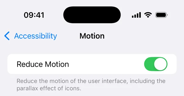
Reducing Motion of Animations Apple's Human Interface Guide advises against adding motion to a user interface without a purpose, as it can be distracting and uncomfortable for users. Motion should be optional and not the only way to communicate important information. Certain types of motion, such as oscillating motions and large animations, can be problematic for users. Users can request to reduce motion in their device accessibility settings, which can affect standard view transitions. However, custom animations require developers to take action themselves by disabling or replacing problematic motion. The reduce motion setting can be detected in SwiftUI views using the @Environment property. The documentation suggests avoiding large animations that simulate the third dimension when the reduce motion setting is enabled. To disable animations, developers can create computed properties that take the reduce motion state into account. This can be done by returning nil for the animation when the reduce motion setting is enabled, effectively disabling the animation. Developers need to decide when and how to respond to the reduce motion setting for their own animations. https://useyourloaf.com/blog/reducing-motion-of-animations/ useyourloaf.com
Swift Parameterized Testing Apple introduced Swift Testing at WWDC24, which allows passing arguments to a test function using the @Test macro's arguments parameter. This feature enables parameterized testing, where the test function is called once for each value in the arguments collection. The Test Navigator displays the results of each test run. If two arguments are passed, Swift Testing generates test cases for all combinations of the two arguments. However, there is a limit of at most two arguments, and if not all combinations are needed, the arguments can be zipped to pair them. This feature is useful when testing a collection of input arguments that expect the same result. It can be particularly convenient when using a CaseIterable enum to drive the tests. The author found this feature useful when migrating XCTest-based unit tests to Swift Testing, especially when verifying attributes of Core Data managed object classes. The Swift Testing approach has advantages over using a for-loop, including independent test cases that can run in parallel and clearer failure reporting. Overall, parameterized testing in Swift Testing can simplify and combine tests, making it a useful feature in practice. https://useyourloaf.com/blog/swift-parameterized-testing/ useyourloaf.com
Migrating XCTest to Swift Testing Swift Testing is an open-source testing framework designed for Swift, introduced by Apple at WWDC24 and shipped with Xcode 16. It uses modern features like concurrency and macros, and supports Windows and Linux as well as Apple's platforms. There's no urgent reason to migrate from XCTest, but Swift Testing offers several advantages, including the ability to run tests in-process using Swift Concurrency, which allows for parallel testing on physical devices.To get started with Swift Testing, you can mix XCTest and Swift Testing unit tests in a test target, but you should not mix testing frameworks within a test. You can import the Swift Testing framework by adding "import Testing" to your test file. Apple recommends grouping tests by adding them to a type, such as a struct or class, and using the init method for setup and teardown.Swift Testing tests are normal Swift methods that become unit tests when you add the @Test macro. You can mark test methods with async or throws and isolate them to an actor as needed. The @Test attribute is a macro that can be expanded to see the implementation.Swift Testing uses the #expect and #require macros for assertions, which offer more flexibility and informative error messages than XCTest's XCTAssert. The #expect macro logs failed expectations and continues the test, while the #require macro is a throwing version that stops test execution on error.You can also use Issue.record to cause a test to fail without evaluating a condition, similar to XCTFail in XCTest. Overall, Swift Testing offers several advantages over XCTest, including improved concurrency support and more flexible assertions. https://useyourloaf.com/blog/migrating-xctest-to-swift-testing/ useyourloaf.com
SwiftUI Charts Plotting Functions iOS 18's SwiftUI Charts framework now supports function plotting using LinePlot and AreaPlot. These charts accept functions that map Doubles to Doubles. The functions can handle undefined values by returning Double.nan or Double.infinity. A single function in AreaPlot fills the area between the function and the x-axis. Two functions can define an area between them. Function plotting aids in visualizing data against expected functional approximations. Combining bar charts with function plots allows for direct comparison. An example shows comparing a bar chart to a parabola using both AreaPlot and LinePlot. The new feature was announced at WWDC24. The information was originally posted on useyourloaf.com. https://useyourloaf.com/blog/swiftui-charts-plotting-functions/ useyourloaf.com
Automatic Trait Tracking In iOS 18, UIKit introduces automatic trait tracking, which eliminates the need to manually register for trait change notifications in layout update methods. This feature is supported in various methods of views and view controllers, including UIView's layoutSubviews, updatesConstraints, and draw, as well as UIViewController's viewWillLayoutSubviews and updateViewConstraints. When UIKit calls one of these methods, it notes which traits are accessed and automatically invalidates the view when those traits change. This is done using methods like setNeedsLayout, setNeedsUpdateConstraints, setNeedsDisplay, or setNeedsUpdateConfiguration. For example, in a UIView subclass that overrides draw, accessing the preferredContentSizeCategory trait will trigger an automatic call to setNeedsDisplay when the trait changes. Prior to iOS 18, developers had to manually register for trait changes and call setNeedsDisplay to trigger a new call to draw. However, with automatic trait tracking, this process is now handled by UIKit. This feature simplifies the process of responding to trait changes and reduces the amount of code needed. Automatic trait tracking is a significant improvement in iOS 18, making it easier for developers to create adaptive and responsive user interfaces. https://useyourloaf.com/blog/automatic-trait-tracking/ useyourloaf.com
SwiftUI Self-Sizing Flow Layouts The article discusses how to create a card layout in SwiftUI using the UICollectionView and UICollectionViewFlowLayout. It explains how to calculate the ideal size for the cards, determine the number of cards in a row and column, and place the subviews in the container. The article also covers caching and how to use the custom layout in a vertical scroll view. https://useyourloaf.com/blog/swiftui-self-sizing-flow-layouts/ useyourloaf.com
Conditional SwiftUI Accessibility Labels In iOS 18, Apple introduced an optional isEnabled parameter to various accessibility modifiers in SwiftUI. This parameter allows developers to conditionally apply accessibility modifiers based on specific conditions. The isEnabled parameter is available for modifiers such as .accessibilityLabel, .accessibilityInputLabels, .accessibilityValue, and .accessibilityHint. This feature is useful when developers need to override default accessibility behavior conditionally. For example, in a list of items with a button to toggle favorite status, the default accessibility label for the button action can be changed based on the favorite status. Instead of providing a conditional accessibility label, developers can use the isEnabled variant of the modifier to apply a custom label only when a specific condition is met. This approach avoids repeating and localizing the default label. In the example provided, the .accessibilityLabel modifier is used with the isEnabled parameter to apply a custom label "Unfavorite" only when the item is favorited. This is a small improvement that simplifies the code and reduces localization efforts. The introduction of the isEnabled parameter in iOS 18 enhances the flexibility of accessibility modifiers in SwiftUI. https://useyourloaf.com/blog/conditional-swiftui-accessibility-labels/ useyourloaf.com
iPhone 16 Screen Sizes Apple has unveiled the iPhone 16 lineup, discontinuing the iPhone 15 Pro models and expanding the base iPhone 16 series with enhanced features. The Pro models witness an increase in screen size, with the iPhone 16 Pro featuring a 6.3-inch display and the iPhone 16 Pro Max sporting a 6.9-inch screen. Despite having larger screens, the Pro models maintain their compact form factor thanks to reduced bezels. All models now boast the Action and Camera Control buttons, along with the A18 chip. The base iPhone 16 models retain their screen sizes but still lack ProMotion and the Always-on display, while retaining the aluminum body. The iPhone 16 Plus shares the same specifications as the iPhone 16 but with a larger screen and enhanced battery life. The Pro models continue to offer exclusive features like USB-3 support, ProMotion display, and Always-on display, along with the titanium body. Despite the larger displays, the Pro models have slightly increased dimensions compared to their predecessors. App Store Connect now simplifies the process by requiring only one set of screenshots for iPhone, which can be either for the 6.9-inch or 6.5-inch display. Overall, the iPhone 16 series brings iterative improvements with larger screens, enhanced features, and a refined design. https://useyourloaf.com/blog/iphone-16-screen-sizes/ useyourloaf.com
SwiftData Expressions SwiftData in iOS 18 supports predicate expressions, similar to Core Data's NSExpression.Predicate expressions allow for complex queries and calculations, using Foundation's #Expression macro.In Core Data, NSExpression allows for aggregate queries like finding minimum and maximum values.SwiftData's predicate expressions can evaluate arbitrary types as part of predicates.An example is finding items with at least two records with a score of 90 or more.SwiftData's predicate expressions use PredicateExpressions, which offer a range of methods.However, some methods, like finding maximum values, do not work consistently.SwiftData's predicate expressions currently provide limited advantages over direct predicate writing.The documentation for SwiftData's new features can be found on Apple's developer website.Future updates may improve the functionality of predicate expressions in SwiftData. https://useyourloaf.com/blog/swiftdata-expressions/ useyourloaf.com
SwiftUI Previewable Macro 1. Apple's Previewable macro in iOS 18 generates boilerplate wrapper views for SwiftUI previews with State bindings. 2. SwiftUI previews can enhance the view creation experience but often require container views with state bindings. 3. The Previewable macro eliminates the need for manual wrapper views by declaring @State properties directly in the Preview. 4. The macro creates a wrapper view with the necessary state properties. 5. To use the Previewable macro, mark @State properties at the Preview root with the @Previewable macro. 6. The macro transforms into a wrapper view containing the state properties and the preview view. 7. The wrapper view generated by the Previewable macro resembles manually created wrapper views. 8. The Previewable macro simplifies the creation of interactive SwiftUI previews with state bindings. 9. It reduces the boilerplate code required for wrapper views, streamlining the development process. 10. Refer to WWDC24's "What's new in SwiftUI" for more information on the Previewable macro and other SwiftUI advancements. https://useyourloaf.com/blog/swiftui-previewable-macro/ useyourloaf.com
Disabling Xcode Asset Symbol Generation Xcode 16 introduces an "Asset Symbols" property in asset catalogs to control symbol generation.This property allows Swift Packages to opt-out of symbol generation, which was previously not possible.The default setting is "Inherited," which inherits from project/target settings."Extensions On" enables symbol generation, while "Extensions Off" disables it for individual asset catalogs in Swift packages.Symbol generation creates Swift and Objective-C symbols for colors and images in the asset catalog.By default, symbol generation is enabled for new projects, but it can be customized in project settings.Generated color symbols are static properties of ColorResource, while image symbols are static properties of ImageResource.Framework extensions for SwiftUI, UIKit, and AppKit types are also generated, but framework support can be restricted.The initial letter of generated symbols is lowercase, even if the asset catalog name starts with an uppercase letter.This opt-out feature allows Swift Packages to avoid symbol generation conflicts and provides more control over asset symbol usage. https://useyourloaf.com/blog/disabling-xcode-asset-symbol-generation/ useyourloaf.com
Entry Macro for Custom SwiftUI Environment Values The Entry macro simplifies customization of the SwiftUI environment by reducing boilerplate code. It eliminates the need to create environment keys and extend the environment with getters and setters. Users can directly extend the environment using the @Entry macro, providing a default value if desired. The macro generates code that handles the internal key and value storage. It supports Transaction, ContainerValues, and FocusedValues, and is compatible with iOS 13 and later. The macro's use case is creating custom environment values, and it provides a more concise and streamlined approach compared to manual implementation. https://useyourloaf.com/blog/entry-macro-for-custom-swiftui-environment-values/ useyourloaf.com
SwiftData Indexes SwiftData, introduced in iOS 17, initially lacked database indexing capabilities. iOS 18 rectified this omission, allowing for fetch indexes to improve database lookups. Core Data has long supported adding fetch indexes, which accelerate database lookups based on specific properties. In the Xcode Core Data Model Editor, you can add fetch indexes by selecting the entity and using the "Add Fetch Index" option. However, despite iOS 18 introducing support for fetch indexes in SwiftData, Xcode 16 still displays a warning that fetch indexes are not supported. To add SwiftData fetch indexes, use the #Index macro to specify the key path for each index. You can only use the #Index macro once for each model class, so all indexes must be listed in the single macro. Compound indexes, which are useful for sorting items with duplicate properties, can also be added. For more information, refer to the WWDC24 documentation on "What's new in SwiftData." https://useyourloaf.com/blog/swiftdata-indexes/ useyourloaf.com
Swift Switch And If Expressions Swift 5.9 allows if and switch statements to be used as expressions. This enables the return of a value from these statements or their assignment to a variable. For example, a switch expression can be used to determine the last path component of a URL associated with an enum state. However, each branch of the if or each case of the switch must be a single expression. Additionally, the if statement must include an else and return the same type from all branches. These limitations somewhat restrict the usefulness of if and switch expressions. The compiler may require type specification in some cases. To learn more about these expressions, refer to SE-0380. https://useyourloaf.com/blog/swift-switch-and-if-expressions/ useyourloaf.com
Xcode Explicitly Built Modules Xcode 16 introduces experimental "explicitly built modules" to address the issue of implicitly built modules blocking build tasks. This new approach involves Xcode scanning source files to build a dependency graph for all modules, enabling it to build modules with ready dependencies without delays. While explicitly built modules are currently enabled by default for C and Objective-C code, they require an experimental setting for Swift code. Build timelines show that explicit module builds start compiling modules earlier, but initial testing suggests they may be slower than implicit builds. Explicitly built modules also share built modules with the debugger, potentially reducing delays when evaluating expressions. This feature is still experimental in Xcode 16 and may undergo changes in future betas. For more information, refer to Apple's WWDC24 session and article on building with explicit module dependencies. https://useyourloaf.com/blog/xcode-explicitly-built-modules/ useyourloaf.com
WWDC 2024 Viewing Guide To navigate WWDC 2024 sessions, start with the Platforms State of the Union for an overview of the year's updates. Swift 6 introduces language enhancements and a new Static Linux SDK. SwiftUI receives updates, including a floating tab bar and custom controls. UIKit also has enhancements, such as a document launch experience and new animations. iPadOS focuses on improving the tab and sidebar experience. AppKit gains new features like Writing Tools API and Window Tiling. watchOS introduces Live Activities, while tvOS encourages migrating TVML apps to SwiftUI. Cross-platform sessions cover UI animations and the new document launch experience. Xcode 16 brings code completion with on-device models and Previewable macros. Developers can also benefit from the Swift Testing framework and Xcode Cloud workflows. Localization and Accessibility updates include multi-lingual keyboard support and improved Dynamic Type scaling. StoreKit and In-App Purchase see transaction history enhancements and new privacy-preserving ad attribution with AdAttributionKit. https://useyourloaf.com/blog/wwdc-2024-viewing-guide/ useyourloaf.com
iPad 2024 Screen Sizes Apple has introduced four new iPad models: the 13-inch and 11-inch iPad Pro (M4), and the 13-inch and 11-inch iPad Air (M2).The iPad Pro features an M4 chip, a new Ultra Retina XDR OLED screen, and a landscape-facing Face ID camera.The iPad Air receives an M2 chip but retains its IPS Liquid Retina display and Touch ID.The 13-inch models have the same display size as the previous 12.9-inch and 10.9-inch models, despite the new naming convention.The Pro models are thinner than the Air, with the 13-inch at 5.1mm and the 11-inch at 5.3mm.All four models support the Apple Pencil Pro and Apple Pencil (USB-C), with the first/second generation Apple Pencils no longer compatible.The 10-core CPU with 4 performance cores and 16GB RAM is available on Pro models with at least 1TB storage.The entry-level iPad (10th generation) and iPad mini (6th generation) remain unchanged.Developers should upload App Store screenshots for both the 13-inch iPad and the 12.9-inch iPad Pro (2nd Gen), as the 13-inch screenshots can represent either the Pro or Air models with the same display size. https://useyourloaf.com/blog/ipad-2024-screen-sizes/ useyourloaf.com
SwiftUI Pie Charts 1. Apple introduces pie charts in SwiftUI with iOS 17. 2. Pie charts are created using the SectorMark view with an "angle" parameter representing the size of each sector. 3. Data can be plotted either with fixed ranges or dynamic values. 4. Sector marks can be customized with inner and outer radii, as well as angular insets. 5. SwiftUI charts offer extensive customization options, including corner radius and legend configuration. 6. The chart background can be used to display a view in the center of the pie chart. 7. Interactivity can be added by using the .chartAngleSelection view modifier and finding the selected sector. 8. Selected sectors can be highlighted by adjusting their opacity. 9. A custom title view can be displayed in the background to show details about the selected sector. 10. Apple provides additional resources and examples to explore pie charts in SwiftUI. https://useyourloaf.com/blog/swiftui-pie-charts/ useyourloaf.com